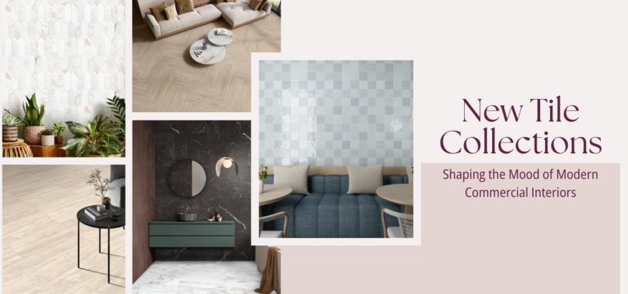

Every room tells a story the moment you step inside, and tile finishes can be one of its most important storytellers. From soothing earth tones to bold geometric patterns, the psychology of tile shapes how we feel and function within a space. Whatever the desired mood, UMORE empowers you to bring it to life. Let’s explore some of the latest floor tile trends that will elevate the ambiance of your space and transform it into something that perfectly reflects your unique style.

Design Psychology and User Experience
At its core, design psychology is about the emotions we experience when we enter a space. It asks, “How do you want people to feel as they walk through the door?” For designers, the answer should always be user-centered. Tile isn’t just a finishing touch; it plays a critical role in how we perceive and interact with our environment.
Perception is powerful. The color of the floor, the direction of a pattern, and even the shape of each tile can influence how we move through a room. Design theory teaches us that these details are never random. They are chosen with intention, each one working to evoke a specific feeling, calm, energy, focus, or creativity.
How to Approach the Psychology of Tile
So, how should you approach tile psychology in a real project? Start with the user. Consider who will be using the space and what activities will occur there. There are multiple types of approaches to design: Cognitive design examines how the color or pattern of a tile influences people’s behavior. For example, a vibrant red might feel energizing in a gym but could be overwhelming in a pediatric clinic.
Behavioral design asks how users will interact with the space. Consider how tile choices might impact their comfort, mobility, or even their willingness to stay longer. Professional specifiers must cater to a wide range of users and experiences, from healthcare workers who need focus to children who need calming colors, and everyone in between. Successful design is always strategic; it’s about solving problems and creating spaces that feel just right.
Color and Mood: Setting the Emotional Tone
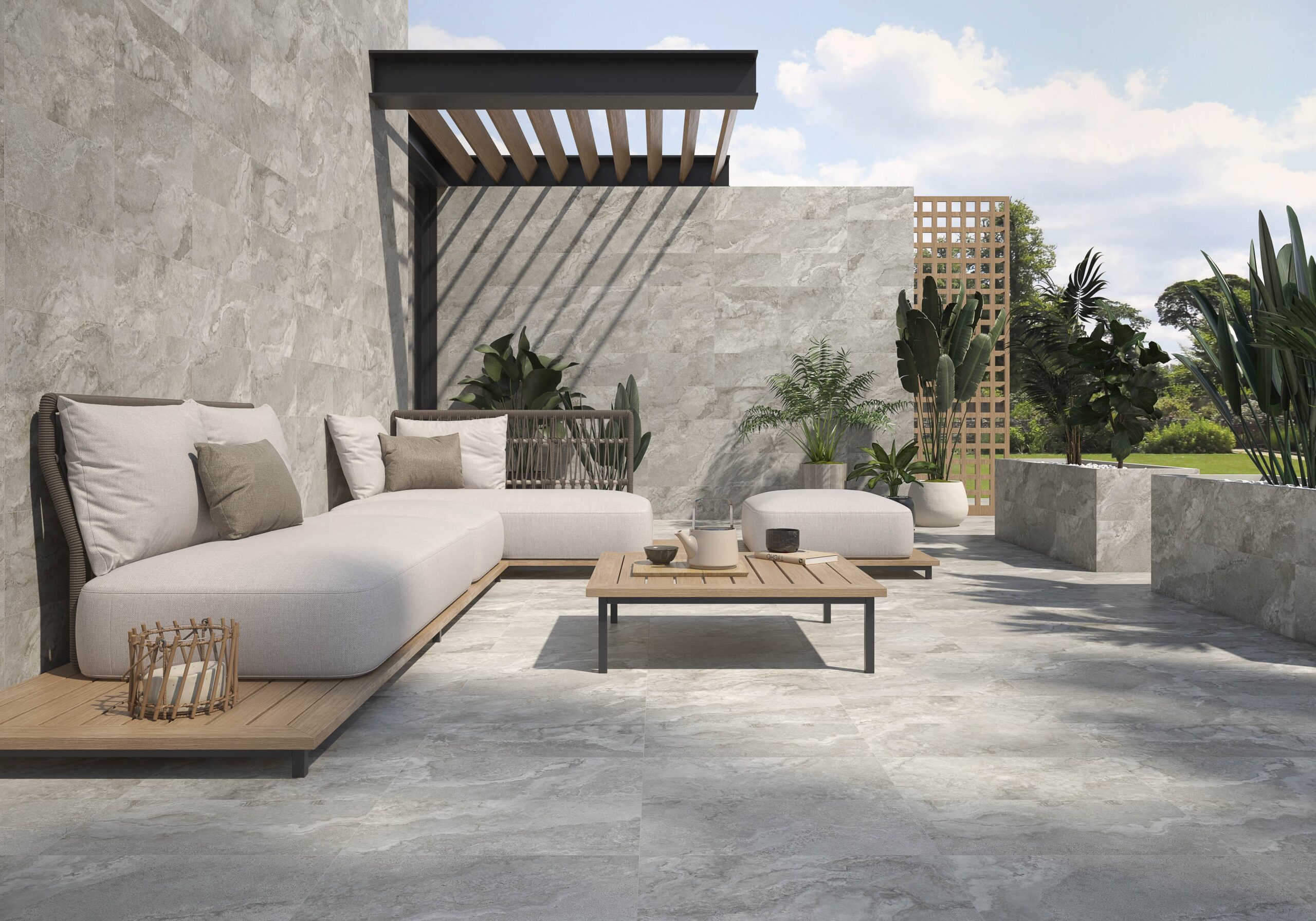
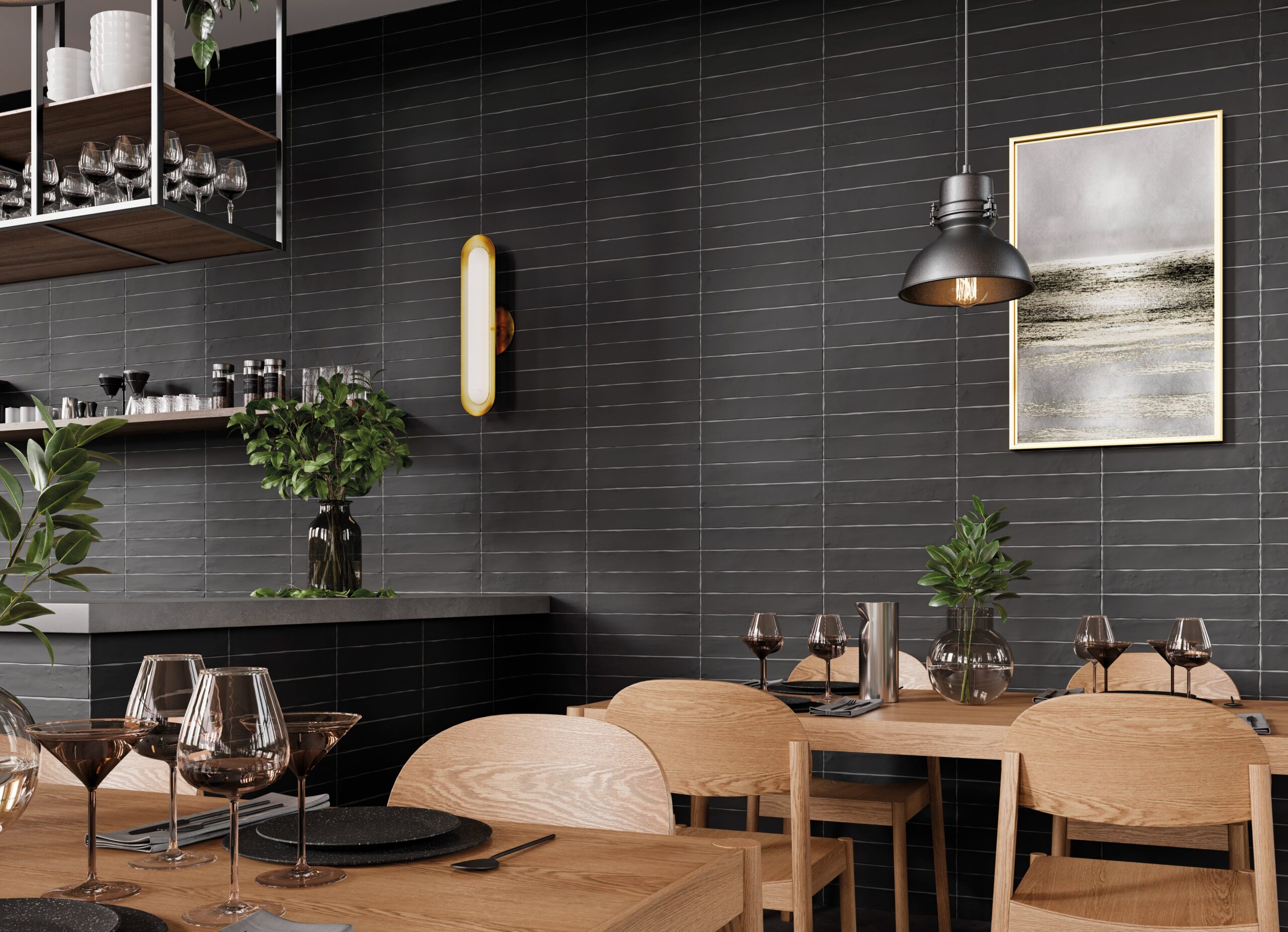
Color is one of the most effective tools for shaping mood. Earth tones, such as beige, gray, and soft green, evoke a sense of peace or tranquility, making them ideal for healthcare, education, or any space where relaxation is paramount. On the other hand, bold primary colors can energize a space, but they also commit you to a specific environment.
For example, purple and gold might be the signature colors of New Orleans, but they rarely suit a hospital environment where calmness is crucial. Auto dealerships avoid primary colors because they want the vehicles they are selling to stand out against a neutral, often monochromatic background. Showrooms often opt for understated finishes to appeal to a wide range of clients, while hospitality spaces tend to go bold with theme-driven color palettes.

Patterns, Shapes, Sizes, and Texture: Beyond Color
Tile psychology isn’t just about color, it’s about the whole package. Patterns can create movement and guide the eye, while shapes such as hexagons or elongated planks can influence the perception of a room’s size and scale. Large-format tiles minimize grout lines, making spaces feel open, while mosaics add intimacy and interest, which often encourages people to linger.
Texture also has a psychological effect. Matte finishes absorb light, adding warmth and a sense of calm. Glossy or textured surfaces can energize a space and highlight architectural details. Every choice, from size to finish, contributes to the mood of a room.

Relationship to Other Finishes
No tile exists in a vacuum. Its effect on mood depends on how it interacts with everything else in the room, i.e., cabinets, furniture, wall color, and even lighting. Designers who ignore this relationship risk creating spaces that feel disjointed or uncomfortable.
Testing tile samples in real lighting and with other finishes helps ensure that everything works together seamlessly. When materials clash, it doesn’t matter how beautiful the tile is, the space will feel off. Thoughtful coordination yields a seamless, harmonious environment where every element complements the others.
Mood and Environmental Examples
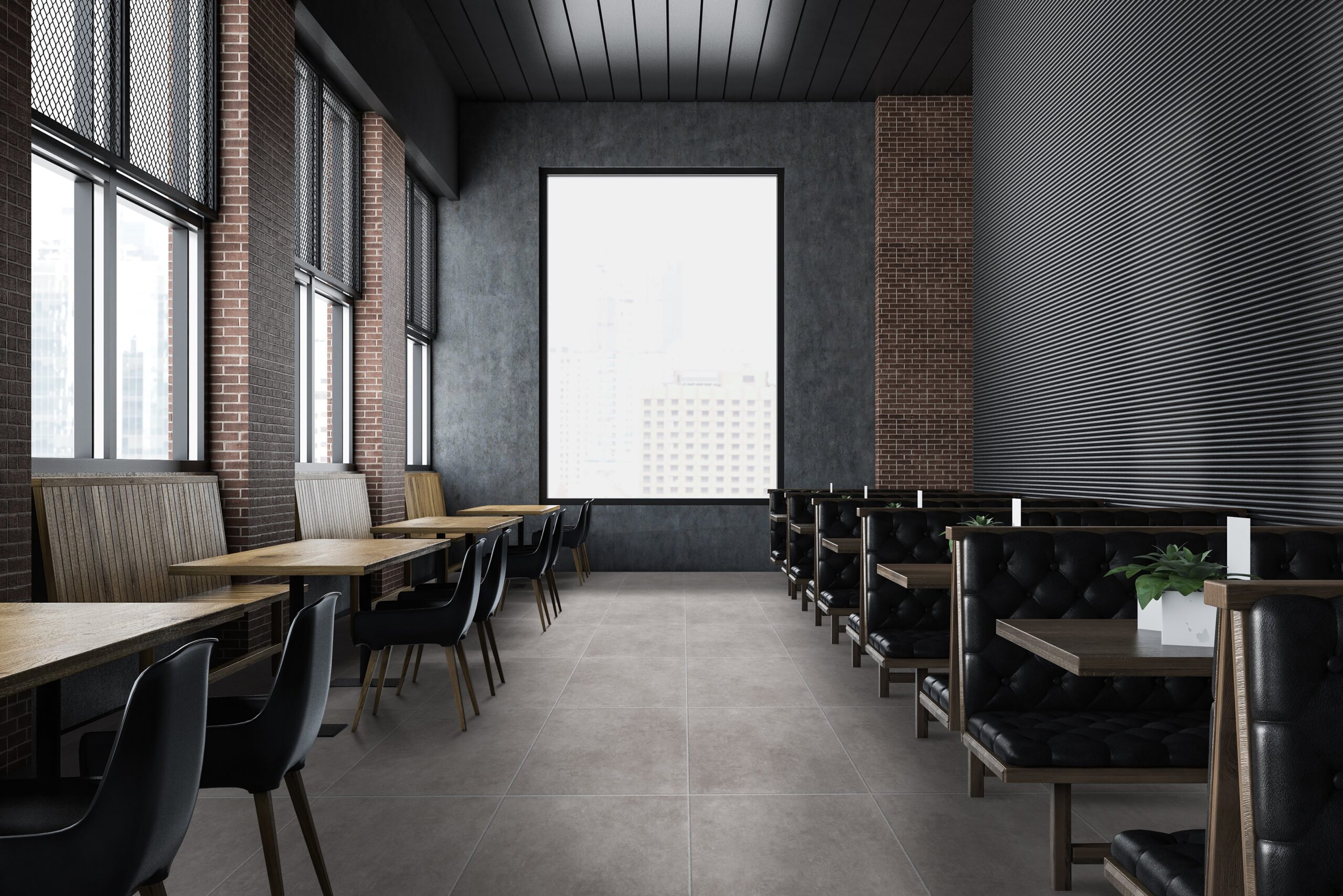
Look to real-world examples to see tile psychology in action. Walk into a Barnes & Noble, and you’ll notice how warm tones and open layouts make you want to browse. Starbucks uses wood-look porcelain tile to create a sense of coziness, encouraging customers to relax and stay longer. In hospitals and schools, color and pattern choices are purposeful, keeping users focused without overstimulation.
Schools, for example, need to keep students engaged without distracting them. The right tile helps achieve that balance. Restaurants and retail spaces often use bolder tiles to reinforce branding and influence customer behavior, whether it’s encouraging a quick meal or inviting guests to remain.
Tile is more than a practical surface, it’s a design tool that shapes mood, behavior, and the entire experience of a space. When chosen with psychology in mind, tile transforms ordinary rooms into places people love to visit and return to. If you’re ready to harness the power of tile for your next project, reach out to our team. Let UMORE help you set the perfect mood and create a space that inspires and uplifts everyone who enters. Find Your UMORE!


